A Smoother, Smarter Streaming Experience
The music‐streaming platform is rolling out a new version of its app that promises a cleaner interface, faster access to favourites and more personalization tools. For subscribers on smartphones and tablets — and soon desktops — this update could change how users navigate and consume their music.
- A Fresh Look: Redesigned Interface for Easier Navigation
- “Quick Access”: Your Music, One Tap Away
- Personalization Enhanced: More Control Over Your Listening
- What It Means for Listeners — and Why It Matters
- Strategic Perspective: Deezer Raises the Bar for Streaming Services
- Conclusion: A Welcome Update for Listeners and Power Users Alike
A Fresh Look: Redesigned Interface for Easier Navigation
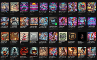
The standout feature of the update is a redesigned user interface. Deezer has streamlined menus, simplified navigation, and improved visual clarity so that users can find what they’re looking for with fewer taps. The new layout helps declutter the screen, prioritizing album covers, playlists and recommended content over menus and buttons. Browsing feels more intuitive and modern — ideal for users who want a clean, straightforward listening experience.
“Quick Access”: Your Music, One Tap Away
The update introduces a “Quick Access” function, designed to give users almost instant access to their most-used content. Whether it’s a favourite playlist, a recently heard album, or a saved podcast, Quick Access brings those items front and center — meaning less scrolling and searching. For heavy users juggling multiple playlists, podcasts, and albums, this means a smoother flow and quicker interactions.
Personalization Enhanced: More Control Over Your Listening
Beyond layout and shortcuts, Deezer’s update brings more personalization options: users can now tailor what they see first — playlists, new releases, podcasts, or recommendations. The platform adapts to the listener’s habits, ensuring the content most relevant to each user remains easily accessible. For people managing large music libraries, this control makes navigation much more efficient and user-friendly.
What It Means for Listeners — and Why It Matters
For subscribers, these changes improve convenience and user satisfaction. A lighter interface and better navigation lower friction in everyday listening. Quick Access reduces time wasted searching for content. And enhanced personalization makes sure the music you want is always a tap away. In short: the update isn’t just cosmetic — it reshapes how listeners interact with their music collections.
Strategic Perspective: Deezer Raises the Bar for Streaming Services
With this update, Deezer demonstrates how even mature streaming platforms must evolve to maintain relevance. In a competitive market where user retention depends as much on experience as on library size, a smart, fluid interface can become a distinguishing feature. Deezer’s move may force rivals to rethink their own UI/UX strategies — and could influence how future music apps balance features, speed, and personalization.
Conclusion: A Welcome Update for Listeners and Power Users Alike
Deezer’s latest update isn’t just about new buttons or a slick design — it’s a refined listening experience. By making music easier to find, simplifying the interface and giving users more control over how they interact with content, Deezer ensures that music streaming remains seamless, personal, and intuitive.
If you’re looking for a smoother, smarter way to enjoy your music, this update makes Deezer worth another look.
![]()


